

Context
Problem
According to Statistics Canada, 18% of Canadians experienced anxiety and mood disorders as of 2022, marking an increase since 2012. While mood-tracking apps help users recognize mood patterns and trends, which can motivate positive change, many fail to provide tools for interpreting the data or actionable recommendations to enhance mental well-being.
Solution
Tranquify is a mobile mood-tracking app designed to empower users to take charge of their mental health. It combines mood tracking with tailored meditation content, offering personalized suggestions and actionable insights based on logged moods. Users can access meditation resources customized to their emotional state, helping them take meaningful steps toward better mental well-being.
Overview
A personalized approach to mental well-being through mood tracking and tailored meditation content.
Role: Graphic Designer, UX/UI Designer, Frontend Developer
Team: Two other teammates
Timeline: January 2024 - April 2024
Tools: Figma, NextJS, Adobe Illustrator, Adobe After Effects
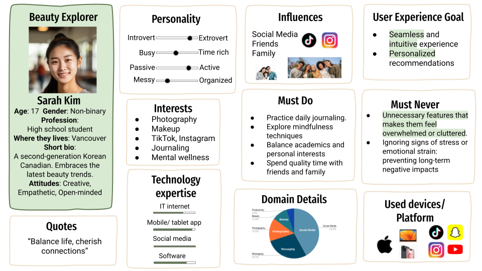
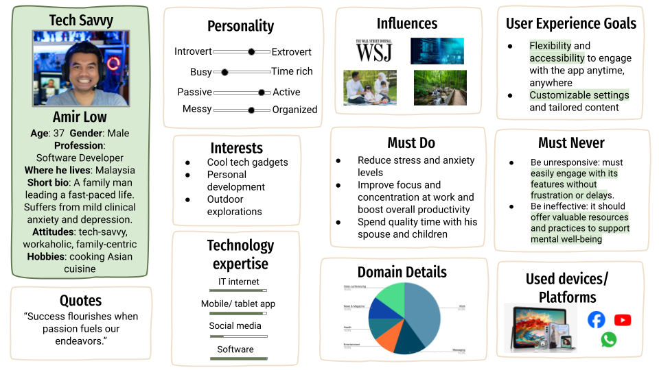
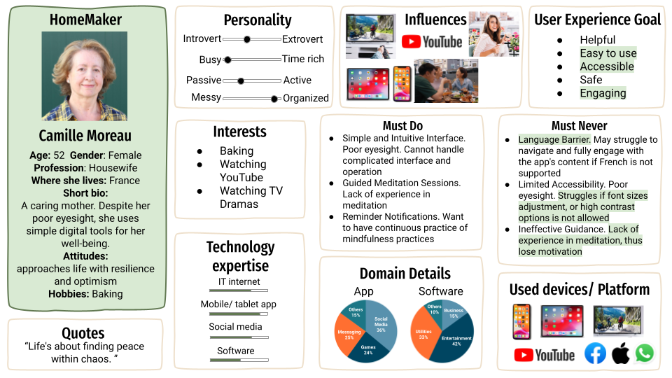
1. Persona
Three personas were created to represent key user groups. Each persona helps to better understand the unique needs and preferences of our target audience.
2. Branding
Logo
Tranquify's logo features a cloud-like shape, embodying the essence of our app aimed at supporting users' mental well-being. With closed eyes and a gentle smile, the logo evokes feelings of calmness and relaxation. To ensure versatility across different sizes, the cloud-shaped character is depicted showing only its face within a rounded square frame.

Color
Tranquify's color palette is designed to promote calmness, stability, and trust while ensuring a visually appealing and comfortable user experience. Light green (#9DB580) serves as the primary color, offering a soothing effect that aligns with our app’s theme of tranquility. Complementary greens, light gray, and warm beige add depth and balance, creating an inviting and harmonious interface.

Typography
Quicksand is chosen for the logo font due to its friendly, rounded style, which complements the smooth, approachable shapes of our logo and mascots. It conveys calmness, inclusiveness, and approachability, aligning with our app’s theme.
DM Sans is selected as the body font for its excellent readability, ensuring a stress-free reading experience across various devices, which is essential for users interacting with mood tracking and meditation content.

Mascots
Our five mascots represent different moods, each depicted in a unique colour palette to maintain consistent tones aligned with our app's design. To enhance inclusivity and approachability, the mascots are intentionally designed with imperfect shapes, conveying the message that it's okay not to be perfect.

Components
The interface elements are designed with accessibility and usability in mind. Buttons feature a rounded shape for a soft, approachable look. We carefully select colors to ensure sufficient contrast, meeting accessibility standards for readability and visibility.

3. UI/UX
Emphasis is placed on creating a seamless, intuitive user flow that allows for natural and effortless navigation. The design choices are carefully aligned with the target audience's needs and preferences, while a cohesive style guide ensures consistency.
Wireframe
The wireframe was created to align team expectations and refine the user experience before transitioning to high-fidelity design.

Onboarding: Provides a quick introduction to help new users get started.
Home: Offers easy access to key features through quick links.
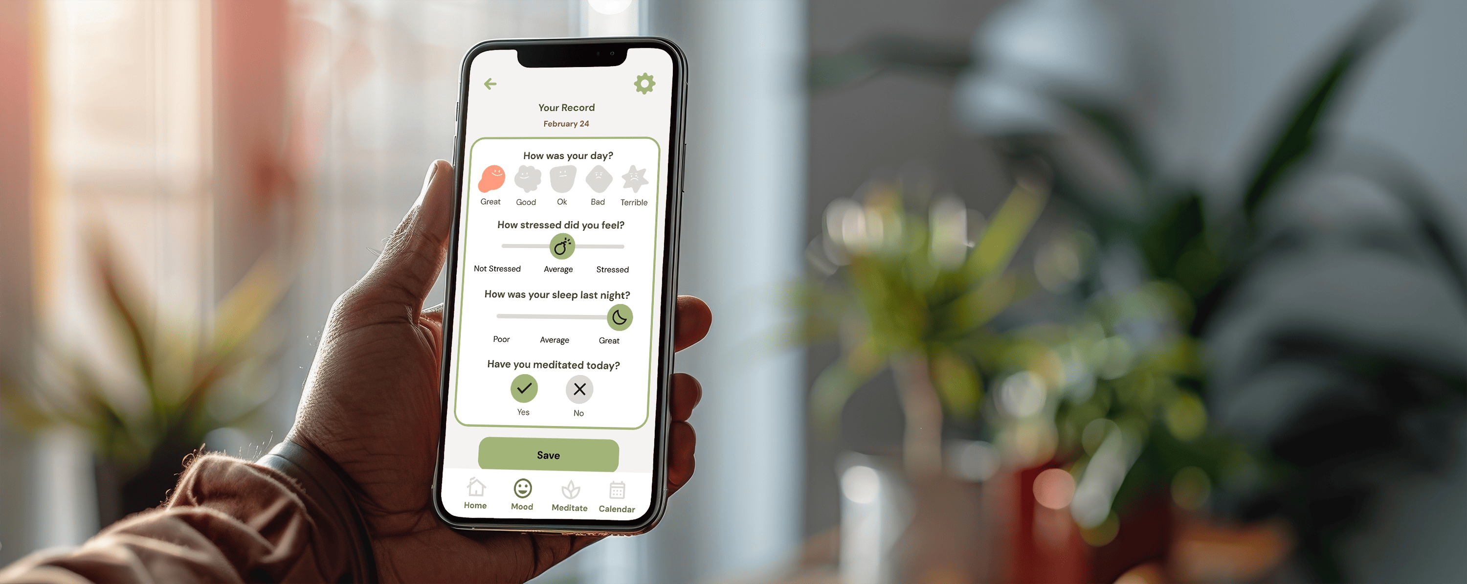
Mood Tracker: Allows users to log their mood by answering questions and receive personalized messages from Tranquify.
Calendar: Displays mood trends over time with a calendar view and past logs
Initial Hi-Fi Design

The high-fidelity design incorporates our color palette and typography while ensuring contrast and readability. The home page is customized for each user, featuring past week mood logs, recommended and favorite meditation content, and a weather display, acknowledging its impact on mood. The meditation page includes category cards for easy navigation, allowing users to quickly find the content they’re looking for.
User Testing
During user testing, participants completed six tasks using Tranquify's Figma mockups. Key issues were identified through their interactions, and based on their feedback, design adjustments were made and implemented in the frontend development.

⇢

1. Labels were added to each section for improved clarity and navigation.

⇢

2. We made the heart icons more prominent and accessible throughout the app.

⇢

3. The weather section on the home page was resized to reduce confusion.


4. Frontend Developing
This project provided my first experience transitioning from design to frontend development, where I gained foundational knowledge of React and Next.js, along with learning API integration to enhance app functionality and user experience.
What's next?
AI Integration
The suggestion messages after logging mood could be enhanced by implementing AI, allowing for more personalized responses rather than relying on preset patterns.
Personal Growth
This project marked my first experience transitioning from branding and UI/UX design to frontend development, where I gained a foundational understanding of React and Next.js. I am eager to deepen my understanding of how frontend and backend systems integrate, with the goal of leveraging my frontend skills in real-world environments. Additionally, I am keen to refine my brand design skills to create more engaging, impactful assets that remain consistent across all platforms.